Image Tips
Right Imagery
|
Size
|
Position
References
Right Imagery
There’s no specific formula when it comes to designing a background or imagery for a hero banner, but it should accurately represent what you intend to convey.
- Try not to put texts on the image. Texts cannot be read by Screen Readers. Less is better!
- If the title and description are layerd on the image, do not place a focal image underneath it.
- Divi: Set a different image for mobile if necessary.
Gutenberg: If the layout adjustment is too much hassle, use a non-full-width layout (Hero Image 1 or 4).
The following samples are using Hero Image 3.
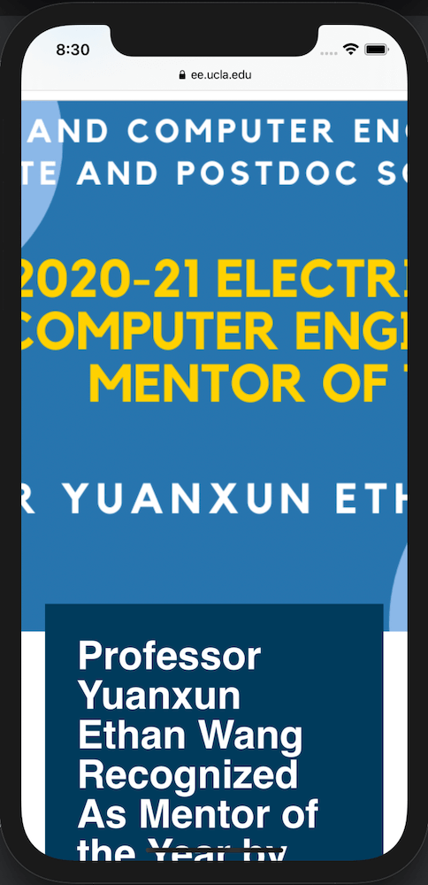
DO NOT
- Cover the focal image by the title.
- Fill the image with texts.
| PC | iPhone |
 |
 |
DO
- Try making the focal image visible on desktop and mobile.
- Meke texts minimum and decorative if you place texts on the image.
| PC | iPhone |
 |
 |
Image size
Keep in mind for loading times. According to the Google research, a loading time increase from 0.4 to 0.9 seconds can reduce traffic by 20%.
- DPI: 300dpi is not needed. 75dpi suffices.
Images on the websites don't need to be as crisp as ones for printing.
- Landscape: Keep the width within 2000px.
Portrait: Set the height within 1000px.
- Compress: Don't upload over 1 MB file to the server.
Before uploading an image to the server, compress it on TinyPNG.
Position
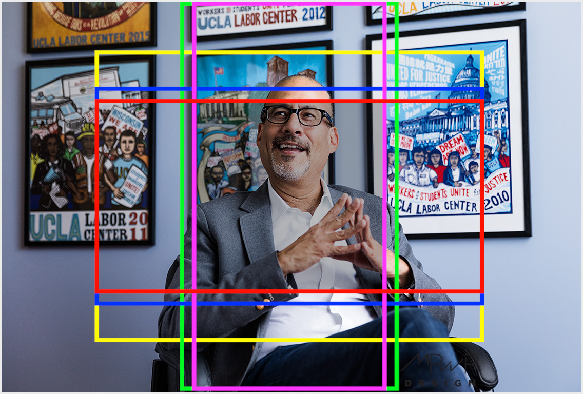
When an image is full-width, be aware of the safe zone. Depending on the device size, the image's visible area is different.
Example
Try using an image that is zoomed out far enough that the subject will remain visible regardless of cropping.
You can download the template and lay it over your image to see what parts of your image will show on devices.
Images are cropped very differently on phones held in portrait orientation.
Example
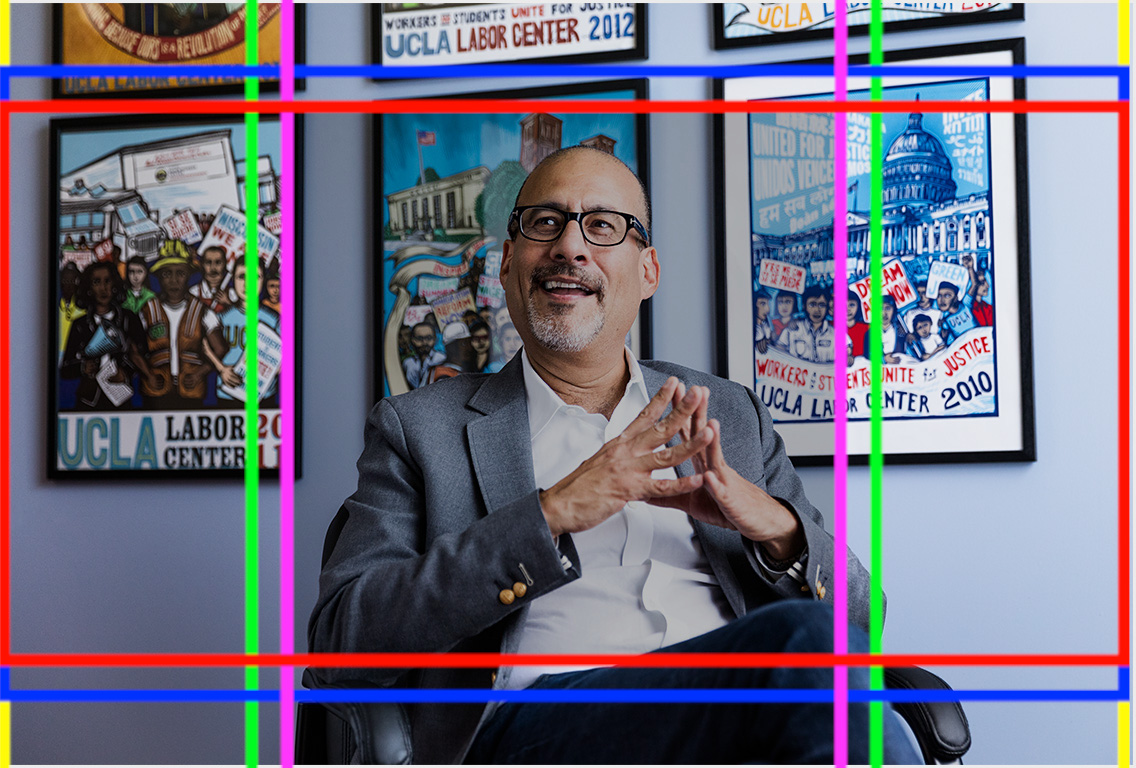
When an image is a rectangular, you need to change the template's size to see how it looks when you rorate your device to portrait/landscape.
- ■ Yellow: a typical 4:3 computer monitor.
- ■ Blue: a smaller viewing area for a 16:9 computer monitor or a cell phone held in landscape orientation.
- ■ Red: shows how an image is further cropped on 2:1 (18:9) phones like the iPhone X.
- ■ Green: a 16:9 phone
- ■ Violet: an 18:9 phone
- ■ The gray box in the middle of the image shows the area that is always visible regardless of the device.
Updated